
Small kitchens are common in Indian flats, where compact cooking spaces need to support busy daily routines. However, limited space does not have to make a kitchen feel cramped. Color can create a lighter, more open look without changing the layout. Kitchen tops matter especially because they cover a large, continuous area and shape the overall visual balance. The right combination of color, finish, and layout can make the space feel more spacious. With a few thoughtful choices, even a modest kitchen can look brighter, calmer,r and more comfortable.
How Color Changes The Sense Of Space
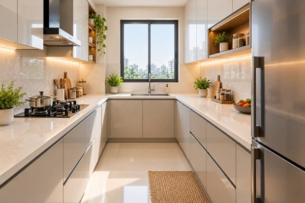
Color can change how large or enclosed a kitchen appears. Light shades reflect more light and tend to make surfaces feel less dominant. Darker tones absorb light, which can make a compact room feel more enclosed.
Contrast also affects how the eye moves around the space. Big differences between cabinets, walls, and the kitchen tops can visually divide the room. Similar tones create a smoother transition, allowing the eye to move across the kitchen without obvious breaks.
This does not mean every small kitchen needs to be white. The aim is to create visual continuity and use color in a way that supports the available natural and artificial light.
Kitchen Top Colors That Open Up A Small Kitchen
The kitchen top forms a visible, unbroken band across the work area. Choosing the right shade can therefore make a noticeable difference to the overall appearance.
Consider these options:
- Soft whites and creams: These shades reflect light and can give the kitchen a clean, open appearance.
- Light greys and warm beiges: These colors add depth without making the worktop look visually heavy.
- Pale stone-inspired tones: Subtle natural-looking shades can add character while keeping the space visually calm.
- Low-contrast veining: Fine patterns can add interest without breaking the worktop’s visual flow.
- Colors close to the cabinets: A worktop in a similar color family can make the kitchen feel more continuous.
For very compact kitchens, avoid creating too many strong color blocks. Keeping the worktop and cabinets within related tones can help the space feel more connected.
Beyond Color: Finish, Continuity And Light
Color is only one part of the equation. The surface finish can also influence how light moves around a small kitchen.
A matt or satin finish can create a soft appearance while being less likely to highlight fingerprints. A lightly polished finish can reflect more light and add brightness. Very high-gloss finishes may reflect strongly, but they can also make smudges more noticeable.
Continuity is another useful consideration. Using the same surface across the worktop and splashback can reduce visual breaks. This can make the kitchen feel more cohesive, especially when wall space is limited.
Lighting can support the effect further. Under-cabinet LED strips can brighten the worktop and reduce dark areas. Warm bulbs can make beige, cream and other warm-toned surfaces feel more inviting.
It is also useful to view samples at different times of the day. Natural daylight changes throughout the day so that a color may look different in the morning and evening.
Getting The Proportions Right
The height and layout of the kitchen top can affect comfort as much as its color. A standard kitchen slab height in many Indian homes is around 85 to 90 cm. However, the ideal height should suit the main cook and the way the kitchen is used.
An uncluttered worktop can also make the room feel more spacious. Too many appliances, containers, and decorative items can interrupt the visual flow.
Consider these layout choices:
- Keep frequently used appliances organized in defined areas.
- Use slim or handleless cabinets where they suit the kitchen style.
- Consider open shelving selectively to avoid making the walls feel heavy.
- Maintain a continuous worktop wherever the layout allows.
- Use tall storage units to keep more items away from the main counter.
- Leave enough clear counter space for everyday preparation.
Good storage matters in a small kitchen because visual clutter can quickly make the room feel crowded. A practical layout keeps the chosen color and finish visible.
Practical Tips For A Small Indian Kitchen
A few simple choices can help you bring the color strategy together:
- Match the worktop tone closely with the cabinets for a continuous appearance.
- Choose a matt or satin finish if you prefer a softer visual effect.
- Extend the same surface into the splashback where practical.
- Select subtle patterns instead of bold, high-contrast designs.
- Add reflective accents through lighting, hardware, or selected accessories.
- Check samples against your cabinet color and wall finish before deciding.
Surface performance also matters when selecting a kitchen top for regular daily use. Features such as scratch, stain, fire, and antibacterial resistance can make maintenance easier. Manufacturers such as Neotra Advanced Surfaces offer engineered surface options designed with these practical considerations in mind.
The goal is not simply to choose the lightest color available. The surface should work with the kitchen’s lighting, storage, cabinet finish, and everyday requirements.
Conclusion
Making a small Indian kitchen look bigger does not require major structural changes. The right kitchen top color can create a lighter, more connected look. Light neutrals, subtle patterns, and related cabinet tones can reduce visual breaks. The finish, lighting, and use of continuous surfaces can strengthen the effect.
Kitchen top height and counter organization also influence how comfortable and open the space feels. By considering color alongside these practical details, you can create a kitchen that feels balanced, functional, and more spacious without changing its actual dimensions.

Santosh Kumar is a Professional SEO and Blogger, With the help of this blog he is trying to share top 10 lists, facts, entertainment news from India and all around the world.